Music Victoria
Member Portal Redesign
2024
UX Case Study
Project Overview
Scope
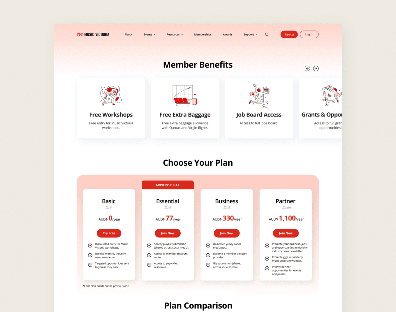
Alongside my 6 team members, We aimed to create a more user-friendly experience, simplifying navigation, enhancing the membership sign-up process, and showcasing membership benefits more effectively for the Music Victoria Website.
Process
Conducted market research and user interviews to understand the challenges of Music Victoria current and potential members. Developed user personas and mapped out user journeys to define key interaction points. Created wireframes and interactive prototypes using Figma, iteratively testing and refining the interactions with target users.
Solution
The redesigned site successfully improved navigation and membership visibility, encouraging upgrades and reducing user frustration. User testing showed higher satisfaction and lower drop-off rates.
The Design Process
As the team leader for this group project, I was responsible for outlining a clear six-week timeline to ensure all team members shared a common understanding of our goals. I structured our research and design phases using the Double Diamond framework. This approach helped us focus on the project's progression. Additionally, I brainstormed and selected research techniques that aligned with our timeline and project scope.
Discover: Gathered data through primary research (user interviews, surveys, and on-site research) to identify user pain points and issues.
Define: Focused on narrowing the scope and addressing specific challenges that aligned with user needs and goals.
Develop: Explored possible solutions, visualised the interface, and ideated on features to address the defined problems.
Deliver: Refined the design through user testing and feedback, ensuring alignment with research findings and user expectations.
Understanding the Issue
What pain points do Music Victoria members experience when navigating the Member Portal?
In our contextual interview sessions, we interview 6 current and potential Music Victoria members to gain insights on users' experiences, focusing on their navigation on the homepage, membership page, navigation, sign-up process, and membership options.
Key insights include:
All participants reported that the page felt overly lengthy, making it challenging to quickly grasp the offered membership options.
Participants described their first impression of Music Victoria as untrustworthy and unreliable, citing blurry images and broken links.
60% of users describe the site as basic and lacking in engagement, which diminished their interest in exploring further.
40% of users reported difficulty locating the sign-up button due to its lack of visibility
Defining the Goals
How can we simplify and condense the key insights into goals?
Using key insights from our interviews, heuristic evaluations, and personal observations, we identified over 50 areas for improvement. To analyse all of our insights, our team conducted a card sorting activity to simplify and condense into more manageable information.
The key goals included:
Improving Overall Navigation
Organise Membership Options
Simplify Log In / Sign Up
Overall Information Visibility
Organisation of Sitemap
Implemented Solutions
Through our 'Discover' and 'Define' stage, we saw many opportunities for improvement. We focused our improvements towards the following areas:
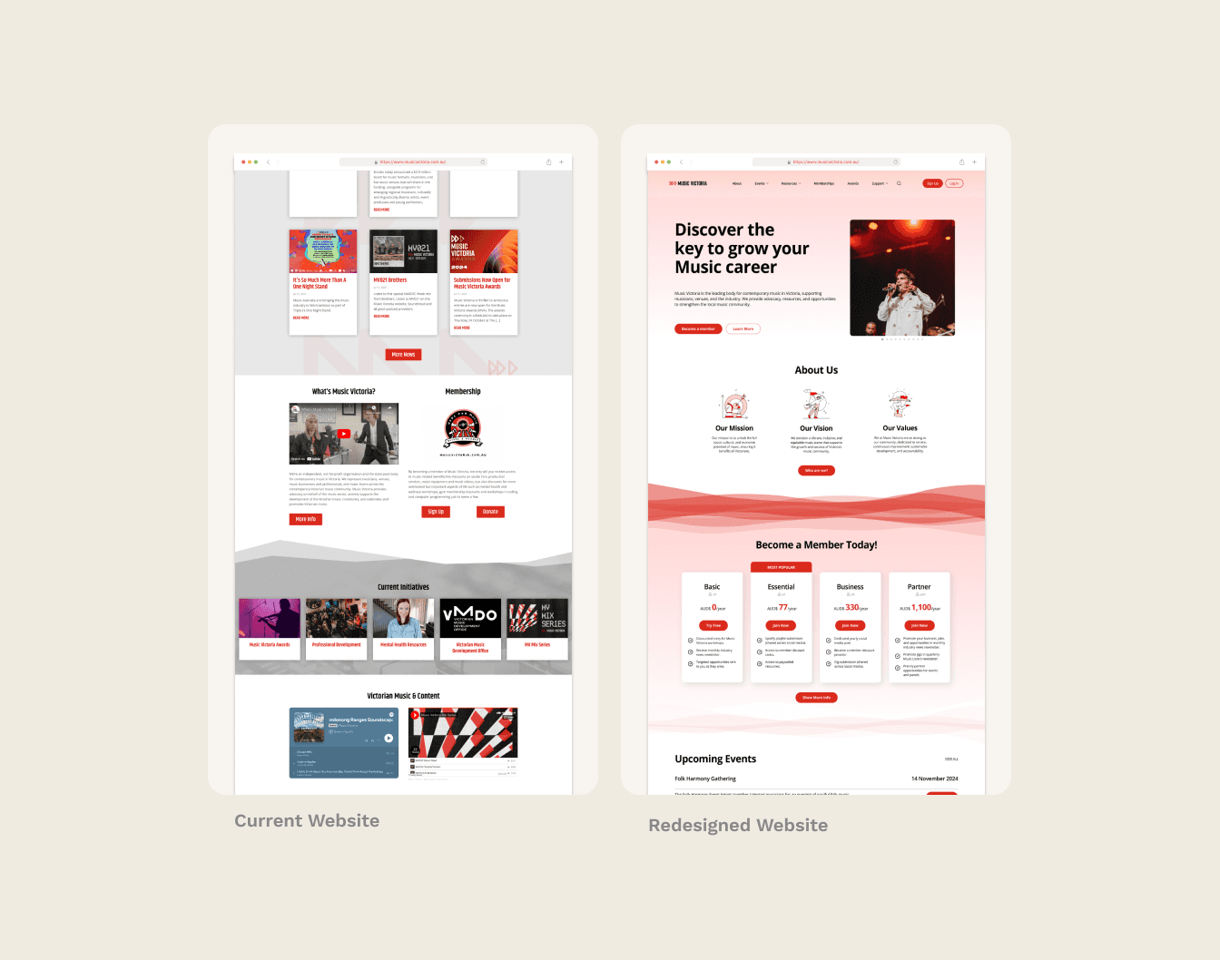
Pain Point #1: Participants described their first impression of Music Victoria as untrustworthy and unreliable, stating they could not understand the organisation's purpose after viewing the homepage.
Solution: We redesigned the homepage to make it a more reliable source of information for new users by clearly outlining its purpose. We added content that answers four key questions new users may have when visiting the website for the first time:
What is Music Victoria?
How do I become a part of Music Victoria?
What benefits and resources does Music Victoria offer?
Is Music Victoria reliable?
Pain Point #2: The current website has inconsistent navigation bars with varying font sizes, wording, and dropdown options, leading to confusion when users navigate to different pages.
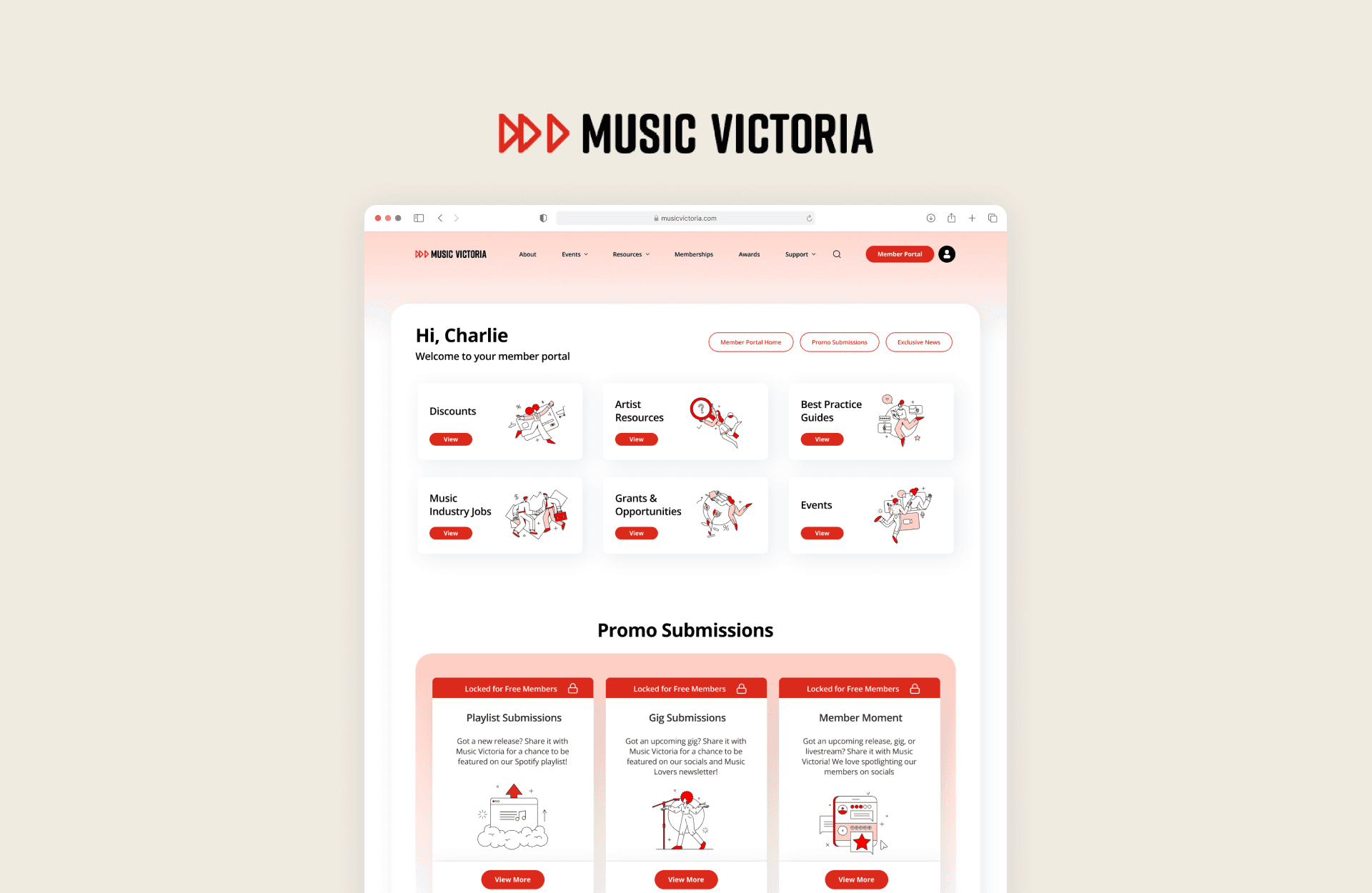
In the redesigned website, the navigation bar will be consistent across all pages, ensuring a cohesive user experience. A secondary navigation bar will be introduced in the Member’s Portal, allowing logged-in members to access specific content without needing to log out.
Pain Point #3: The current website lacks visual consistency in its brand assets, with images, fonts, colours, and content appearing unprofessional, which undermines trust in the organisation’s reliability.
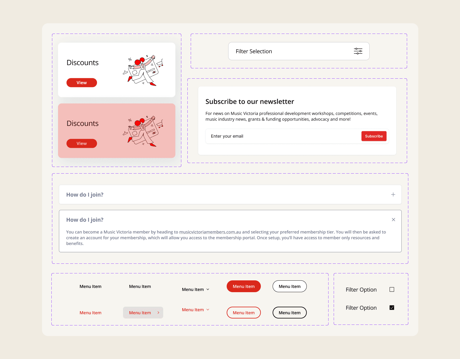
In the redesigned website, illustrations and high-quality, consistent images have replaced stock photos, adding a cohesive and visually appealing touch. Gradients and rounded corners were implemented to create a softer, more modern aesthetic. Clear sections with smoother transitions were designed to improve the flow of information, guiding users naturally through the content. Finally, we ensured that all text, buttons, graphics, and images are cohesive across all pages.


